
Unlock the Power of Data with Microsoft Power BI -- 8 Tips

Power BI makes it easy to build a report. Building one that people trust and keep using is another matter. Eight tips from daily practice.
Tip 1: Data Cleaning: The Foundation of High Quality Data
A stunning report on dirty data is still wrong. Before you build anything, clean the source. Power Query handles this well. A few examples:
Remove duplicates, so redundant entries don't skew your counts.
Filter and sort, to focus on the data that's relevant.
Handle missing data: fill the gaps or remove incomplete records, so they don't distort your insights.
Those are starting points. Be curious and explore the Power Query editor further. The column quality, distribution, and profile features give you a quick grip on the quality of your source data.
 Power BI - Data Profiling
Tip 2: Data Modelling: Building a Solid Framework
A data model is the roadmap for your report: which tables exist and how they relate. If you don't know Kimball modeling yet, look it up. In short, it's a dimensional modeling approach that optimizes tables for query performance, user-friendliness, and consistency, using star or snowflake schemas, conformed dimensions, and hierarchies. It has carried business intelligence for decades for a reason.
The key steps: define relationships between tables with primary and foreign keys, create calculated columns where you need new data derived from existing values, and write DAX measures (Data Analysis Expressions) for the complex aggregations and metrics.
Tip 3: Choose the Right Visuals: Less is More
The goal is a report people understand at a glance. Pick the visual that fits the data: a line chart for sales trends over time, not a pie chart.
A few habits that help: don't overload visuals with unnecessary detail, use a consistent and meaningful color scheme (consider color-blind-friendly palettes), and label everything clearly: axes, titles, charts.
The standard options cover most needs: bar charts to compare data points, line charts for trends and patterns over time, pie charts for proportions (five categories maximum), maps for geographical data, and tables or matrices for structured detail.
And set a theme. A theme is a predefined collection of settings (colors, fonts, formatting) that gives all your business reports the same look and feel. Consistency reads as reliability.
Tip 4: Interactivity: Engage Your Audience
A static report answers one question. An interactive one answers the follow-up questions too. Power BI gives you filters to focus on specific subsets, slicers to refine data views, page and bookmark buttons for a more intuitive way to move through the report, and drill-through to explore the detail behind a visual.
Aim for a web-like experience: tooltips on hover for extra information, a visual pages button, a toggle. Users notice the difference, even if they can't name it.
Tip 5: Don't be afraid to use external tools
Excel: how could I start with anything else? Power Query in Excel can transform and clean data before it goes into Power BI, and Excel itself works as a data source within Power BI.
GitHub: version control isn't just for software teams. Save your report as a Power BI Project (PBIP) file and the report and dataset definitions become plain text files in a simple, intuitive folder structure, ready for Git to manage changes and track history.
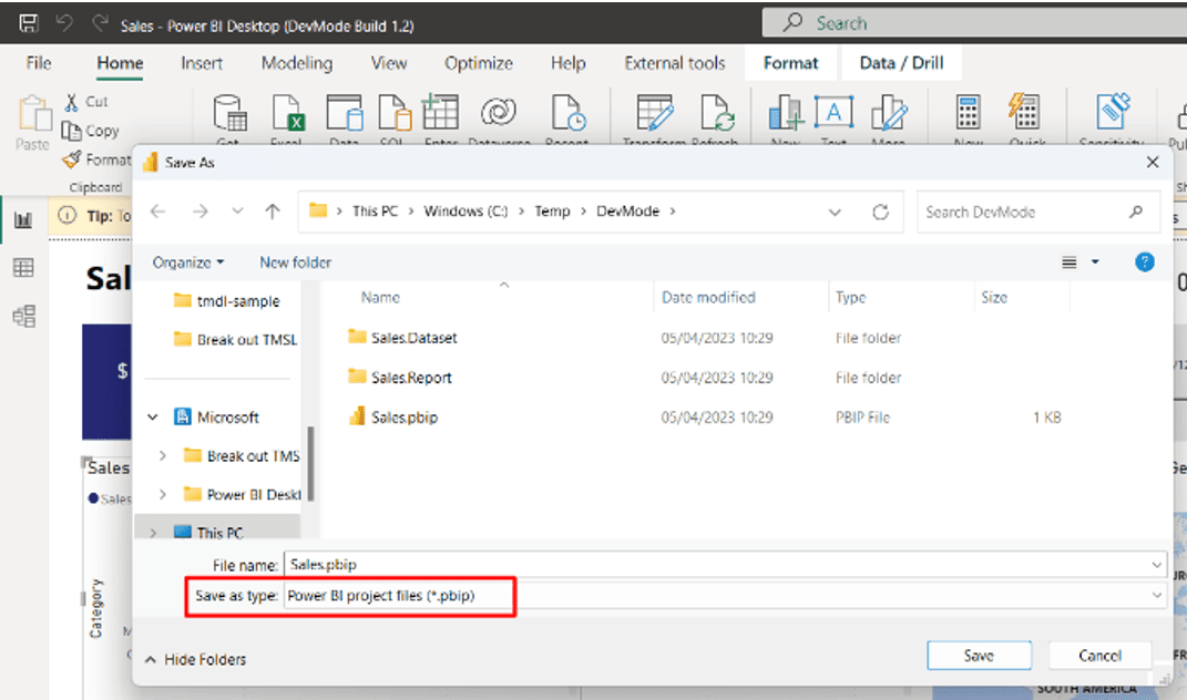 source:
 To turn this on, go to File > Options and settings > Options > Preview features and check the box next to "Power BI Project (.pbip) save option".
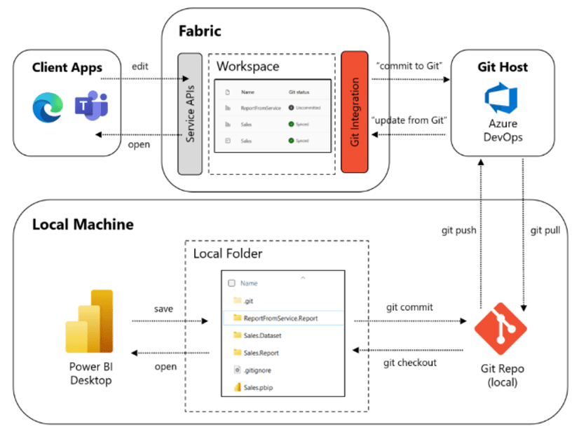 source:
 DAX Studio: a third-party tool for writing, testing, and optimizing the DAX code behind your Power BI reports.
Tabular Editor: advanced editing and management of Tabular models, especially useful for large and complex datasets.
Tip 6: Sharing Insights: Getting Reports to the Right People
A report nobody sees decides nothing. Power BI offers several routes: publish to the web for broad public access, host reports on the Power BI Service where users access, interact, and collaborate in a secure cloud environment, or embed them directly into websites, applications, or SharePoint.
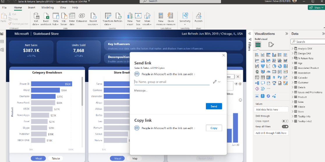
For a small development team, the OneDrive and SharePoint integration is handy: SharePoint's version control lets you restore a report to an earlier point, and the Share button at the top right gives you the standard SharePoint and OneDrive interface to create a shareable link or send the report to the people who need it.
Tip 7: Power BI Mobile App
The Power BI mobile app (iOS and Android) puts your reports and dashboards on the phone. What it brings:
Full interactivity: filtering, drilling down, and exploring data with touch gestures, just like on desktop.
Offline access: download reports and dashboards for places with limited or no connectivity.
Data-driven alerts: a notification on your phone when a metric crosses the threshold you set.
Annotations: add comments and context directly in the app, synchronized across devices, so the discussion travels with the report.
Integration with Microsoft Teams and SharePoint for sharing and collaboration.
Responsive design: optimize reports for small screens in Power BI Desktop, so visuals stay readable.
QR codes: scan one to open a specific report without searching for it.
Cross-device sync: preferences, offline content, annotations, and recent reports follow you from device to device.
For anyone who needs their numbers on the move, it does the job.
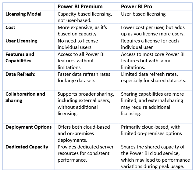
Tip 8: Power BI Premium Vs. Power BI Pro, what is right for you?
Premium or Pro? The licensing question comes up in every project. These are the differences that determine the right fit for your organization:
Wrapping up
Clean data, a solid model, and visuals that respect the reader: that's most of the work. The remaining tips (external tools, sharing, mobile, licensing) make the difference between a report that gets built and a report that gets used. Start with tip 1. The rest follows.
Want to implement this in your workflow, too?

Dennis Guldemont
Dennis has been working in data and analytics for over half a decade, most of it centered on Power BI. He studied Management and IT at Ghent University and specializes in translating analytics requirements from business stakeholders into reports that actually get used. When he's not building dashboards, he's playing guitar through a Marshall amp at a volume his neighbors tolerate.